Gateway to Opportunity
What We Did
Brand Story Research
Visual Identity
Graphic Design
Brand Strategy
Rebranding Alberta’s Third Largest City
Community is the Lethbridge superpower.
Cities in Alberta and across the country look very similar. Some are bigger, some are smaller, some have generic positioning lines, and some are struggling to figure one out. But looks can be deceiving.
Through brand story research, we discovered that there is more to Lethbridge than meets the eye. Lethbridge is invested in doing things the right way, anticipating the public’s needs, and working together to build a vibrant city.
Lethbridge is Alberta’s blueprint for success.
The logo is made up of 3 key parts: the skyline, the path, and the river. These simple elements capture a wealth of meaning that establishes Lethbridge as a place for life, opportunity and purpose.
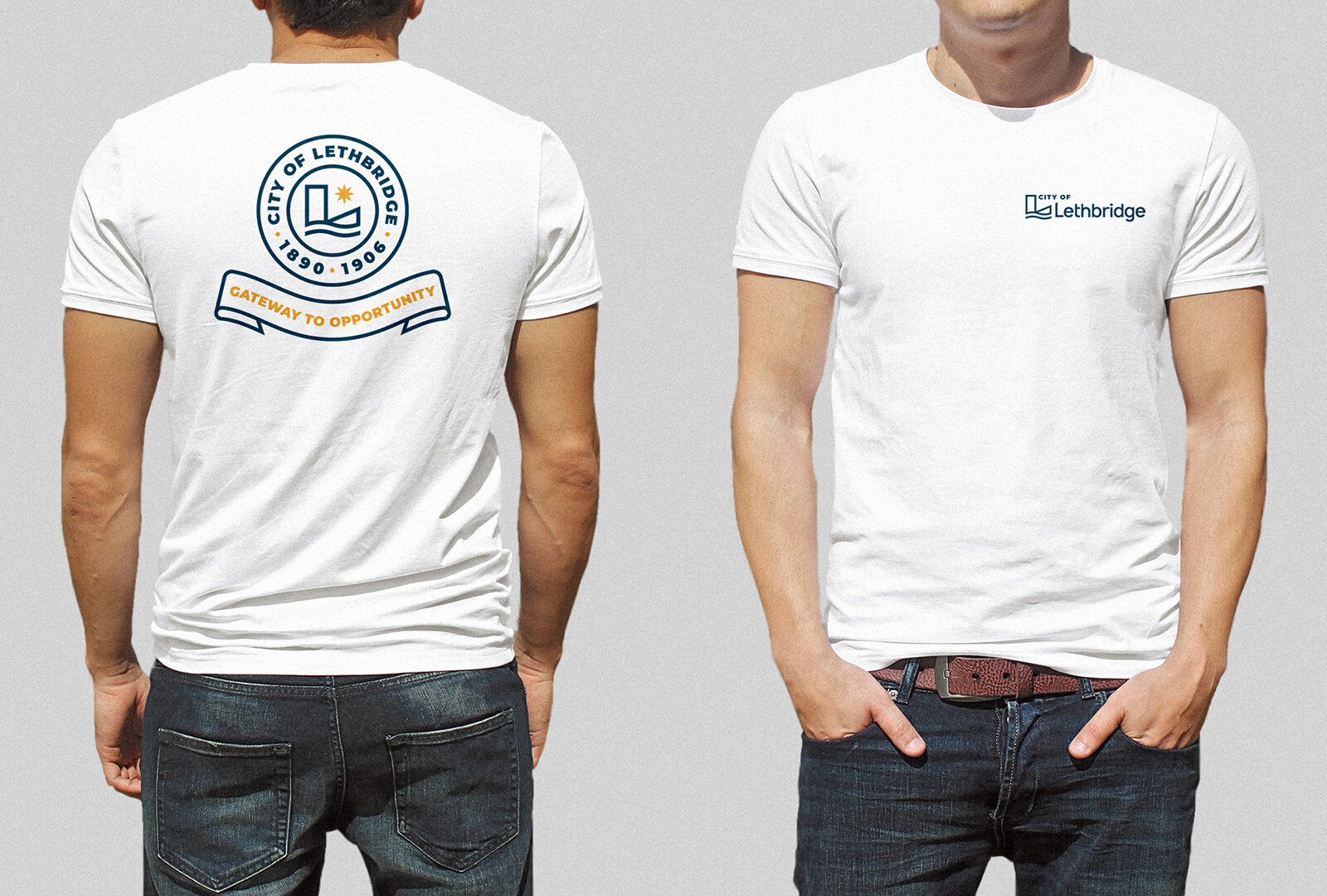
Research suggested that the Latin words on their existing crest was more relevant than ever. Gateway to Opportunity.
We also redesigned the crest to position City of Lethbridge now and for years to come.
The new brand is flexible and usable across any medium including use across social media, on display banners and even on emergency vehicles.
Logo displayed at the Canadian curling championships in Lethbridge.
“We are extremely proud and excited for the new modern City of Lethbridge brand and owe a world of gratitude to The Met Agency for the quality research, strategy and creative they have developed for our organization. I would not hesitate to recommend The Met to any organization embarking on the daunting task of branding. They will collaborate with you throughout the process and their experience and insight will not steer you wrong.”
— Tara Grindle, City of Lethbridge


